Rockstar Website Gets A Redesign
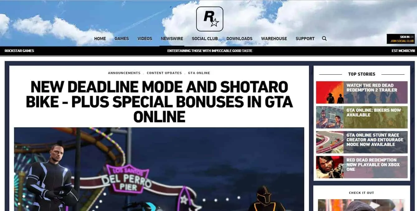
Some of you may have noticed that Rockstar's official website got a redesign recently, around the same time that the Shotaro and Deadline update went live in-game. It's fitting since the inspiration from Tron suggests a flair for the futuristic. Then again, we would understand if you haven't noticed, since our site provides up-to-date coverage on all things GTA, including official Rockstar posts.
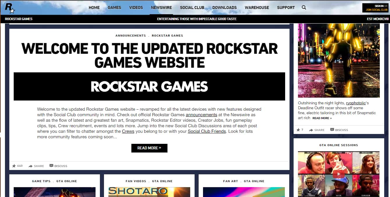
The whole site layout got a makeover. The menu is still at the top of the page, however, the Rockstar logo migrated to the center. Instead of the sidebars showing different images upon reloading, now it's the header that changes. Below you'll find the quippy comments about the company's mentality that lived off to the right side of the site before.
News items are displayed much more prominently, with a wider area allocated to them, as well as an enlarged font. The whole site layout has more of a "tile" thing going on which has been the "in" thing for websites nowadays — it seems like Rockstar is trying to stay hip. The section on the right which shows smaller posts is relegated to non-games related news, such as random happenings connected to Rockstar as a company instead.
While the site looks more polished and modern now than the previous iteration, there was one aspect of the transfer that ruffled a few jimmies — namely, all comments from existing Newswire articles were purged. While this was likely necessary for the transition due to whatever reason, it is odd since many other website transitions manage to retain comments.
However, one great new aspect of the site can only be noticed when not checking it from the comfort of your PC. Rockstar has paid much attention to optimizing the new site for all kinds of mobile devices, something which the old site occasionally struggled with.
What do you think of the new Rockstar website?


